Pulse Brand Case Study
This is a logo, app icon and branding case study I created in 2017 for a pulse ECG app that integrates pulse detection technology in the users phone and their compatible ECG device. I'm currently working on more prototypes for various user flows, so please stay tuned.
As Art Director & lead visual designer, I created a print logo symbol, word-mark, app icon & key app screens. I wanted the logo to show some dimensionality and movement and to align with the word-mark typeface and the overall characteristics associated with heart-rate and ECG technology without being too flat or cliche. I wanted it to be recognizable, dynamic and impactful.
Color was also an important factor and I chose bright and lively colors but nothing that leaned towards gruesome or washed out. I used the brand colors to create a gradient that I felt was attractive and moved away from typical medical color schemes.
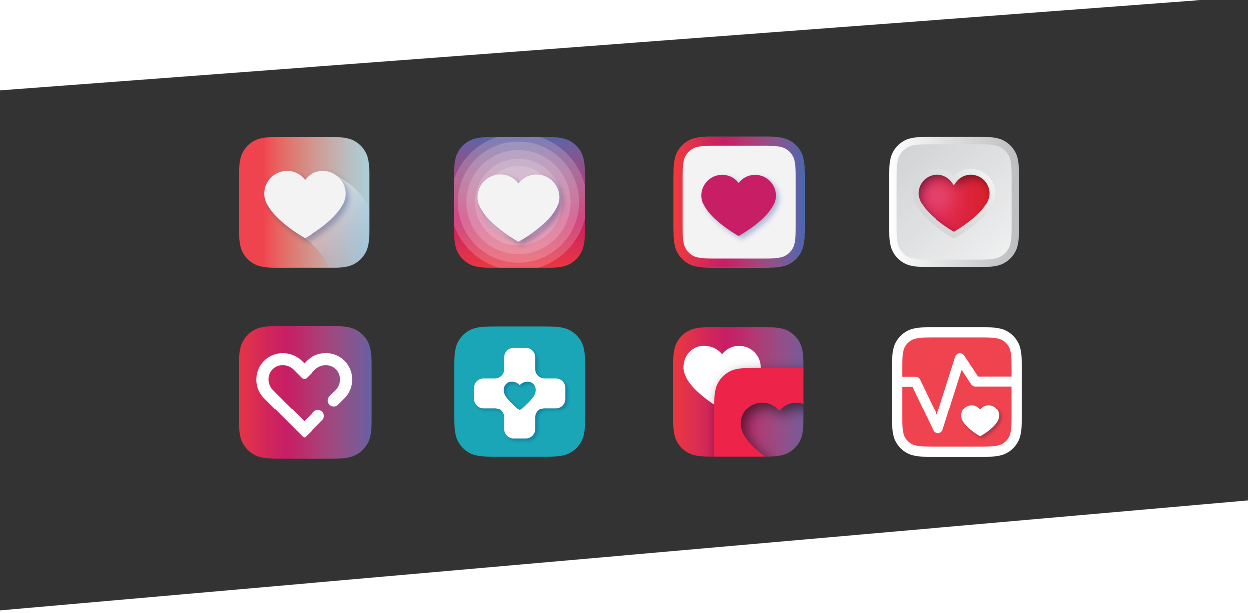
Design notes for screens toward the bottom of the page from left to right: Introduction Screen with Set-up User Profile CTA and secondary CTA (to the on-boarding flow), user's profile screen with default stats iteration, the ECG/Pulse In Progress screen with background color and ECG plotting pill in prehypertension color indications. Below those, are the proposed Current Daily Recording and Main Stat Dashboard screens with scrollable features (in weekly view). The final elements on this page are some app icon explorations that I created but that mainly focus on the inclusion of the heart symbol as dominant element and the defined color palette.


